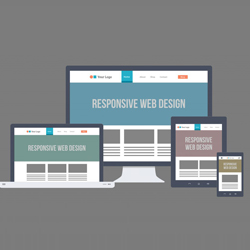
 Responsive web design is not a program or a JavaScript. Responsive web design (RWD) is an approach that makes your web page looks good on all devices like desktops, tablets, and phones or anything in between. It means that desktop web pages are allowed to be viewed in response to the size of the screen or web browser and it gives the same support to different devices for a single website. Responsive Web Design is uses only CSS and HTML to resize, hide, shrink, enlarge, or move the content to make it look good on any screen.
There are three components to create Responsive web design
1. Fluid Grid
2. Fluid Media
3. Media Queries
Each element is a part of the overall responsive solution. In each component we have to follow some code while you develop your responsive design.
Fluid Grids
It allows the layout of a website to expand with page. Without these fluid grids, sites will not fit into the screen of different kind of devices. Columns will automatically scale and move with the grid system as a browser gets larger or smaller so that all content is appropriately aligned.
Fluid Images
Responsive designs permit for font sizes to be flexible and revamped that is why site will not come across a screen with broken, difficult-to-read or unattractive text and also placing a fixed width photos into a flexible grid layout may result in the photo overflowing from the container and spoiling the entire page if the container is not big enough. An image is made into a fluid image by putting some constraints on it, such as constraints prohibiting it from exceeding the size of its container.
Media Queries
It gives the opportunity the designers to produce several layout styles of a website.
Suppose in a small mobile phone, the width of the device becomes too thin, the website design can fall separately. This is where media queries come in. These media queries are based in CSS3 and allow us to not only target the particular device classes but physical characteristics of the device which is rendering the web site.
Advantages:
1. Adopting responsive design, takes less time than creating a separate standalone site.
2. You don’t need a separate mobile URL; it gives one to manage the site.
3. Anyone can use the same content on any device having one responsive site and no matter what the screen size is, it looks good.
4. Responsive web design allows your site move and bends and fit into the frame provided instead of shrinking text and images to fit to the screen and maintaining their original structure. It gives better user experience.
5. Responsive website will increase the number of customers and money.